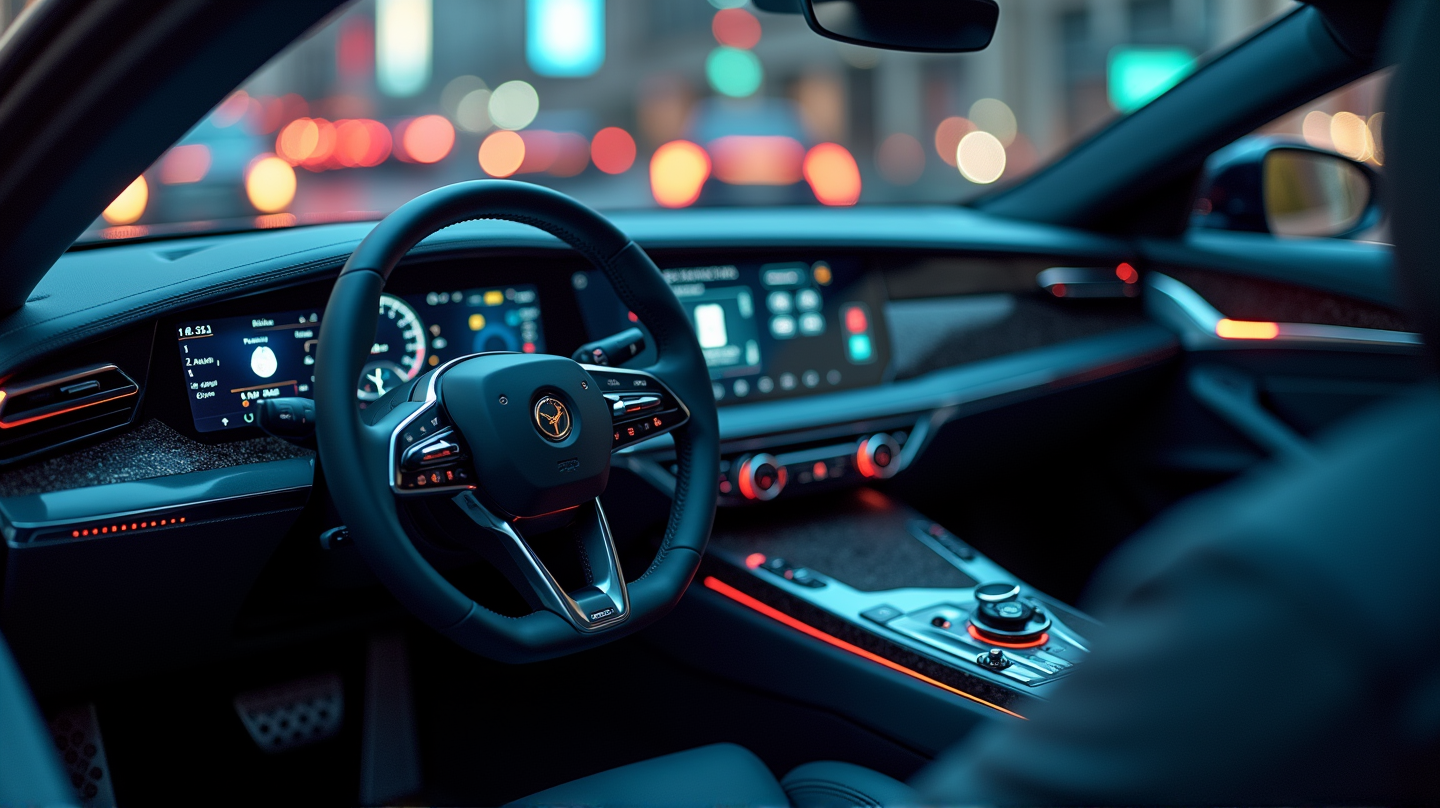
In a bold move that could disrupt Android Auto users’ familiar routines, Google is reportedly experimenting with a new layout for the media player buttons. This potential change being tested in the Android Auto v14.4 beta might shuffle the standard button arrangement, challenging even the most seasoned users’ muscle memory.
An Unfamiliar Challenge
Traditionally, media players present their controls in a predictable layout: the “back” button on the left, the “play/pause” at the center, and the “skip forward” button on the right. Android Auto’s current design sticks to this intuitive routine. However, Google’s test layout dares to rethink this standard by shifting the play/pause button all the way to the left. The familiar routine users have been so accustomed to over the years now faces a potential disruption.
Experiments in the Beta
With the Android Auto v14.4 beta, keen observers from Android Authority discovered this alternative button positioning focused on altering user experience through the dashboard widget. The reconfiguration appears to apply across popular apps like Spotify and YouTube Music. Interestingly, whether this extends to the main UI or remains a dashboard-specific experiment is yet to be clarified.
Muscle Memory vs. Accessibility
Though the new arrangement could potentially make buttons more accessible ergonomically, it risks creating an initial stumbling block for drivers who rely on muscle memory to effortlessly control their media. While some users depend solely on steering wheel commands, the change might seem minor but could require a mental adjustment for those accustomed to the traditional touch method.
Community Reactions
This anticipated update has ignited discussions among the Android Auto community. Enthusiasts question the necessity of altering such a defined feature of their driving tech experience, one that has seamlessly integrated into their daily routines. According to 9to5Google feedback is mixed, with some embracing the improved ergonomic designs while others are skeptical, emphasizing their attachment to the existing arrangement that had become second nature.
In conclusion, the reshuffle in Android Auto’s button design might seem trivial on the surface but holds implications that are stirring curiosity and debate. Whether this shift will remain a test phase novelty or become the new norm is a matter that will unfold as feedback continues to stream in.